How does this website make you feel?
On the surface, it may seem that reading an article on a website is an emotionless experience, but science tells us that we use emotions to inform our understanding. So, yes, you are experiencing an emotion right now, but what could it be? Let’s come back to that question at the end of the article, with enhanced understanding.
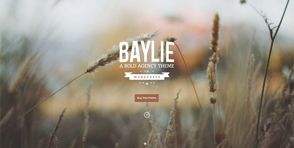
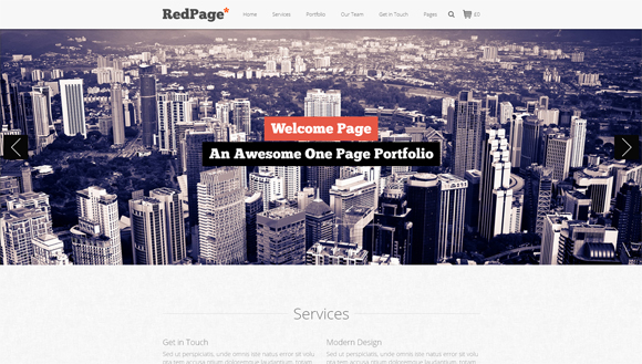
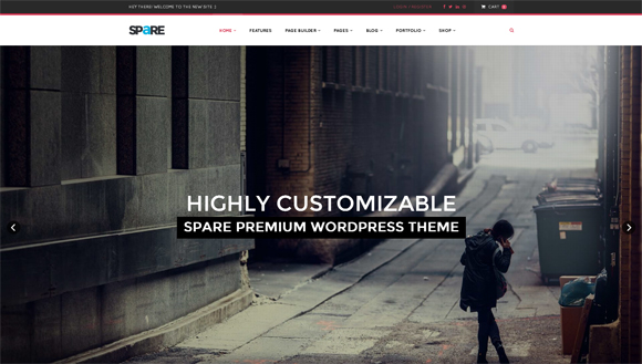
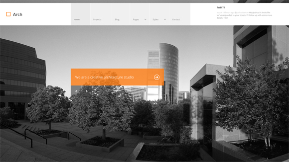
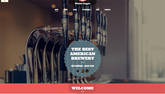
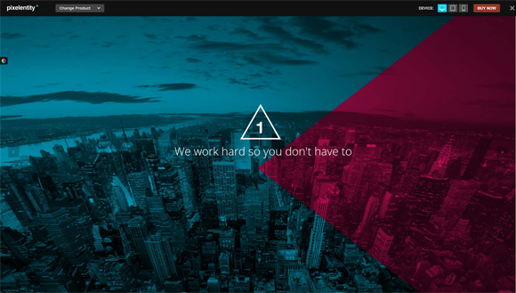
Take a look at these websites:
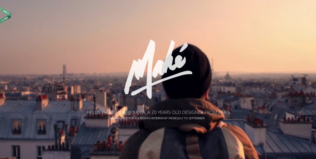
You start out with a perfectly lovely view of Paris–but nothing we’ve haven’t all seen before. What makes you sit up and take notice is the animation effect. It’s simply beautiful and surprising. Although you may not remember everything about this site, you’ll certainly remember the feeling of surprise as you scrolled down for the first time.
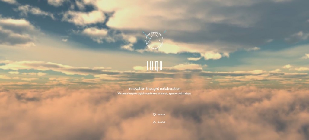
No music, just flight. Who doesn’t love travelling through clouds without leaving your seat? This almost seamless video evokes excitement and anticipation–you’re heading somewhere, you just don’t know where. I can’t tell you how long I’ve stared at this video (it would be embarrassing). The takeaway is that this site stirred my emotions, held my attention, and left a lasting impression.
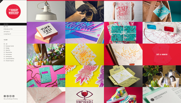
I dare you to pull up this website and not scroll through. Stunning, high-resolution images and intuitive design tell a story that appeals to your emotions.
A recent study on patients affected by hippocampus damage, such as Alzheimer’s disease, shows that emotions linger even after memories fade. Although a visitor may not remember everything you’ve said, they’ll remember the feeling. That feeling will lead them to return again and again.
The point of all design is to engage viewers. Engendering positive emotions can lead to longer visits, higher engagement, and more excitement about your product.
Even on a site like Zen Habits, which is famously minimalist, it’s emotional appeal does not derive solely from text. As a reader, you feel at peace, or zen, on the site because it was designed in such a way as to evoke that emotion within you. There’s no sidebar. There’s no images. But, there is white space, and lots of it. It feels pure, authentic, and truthful.
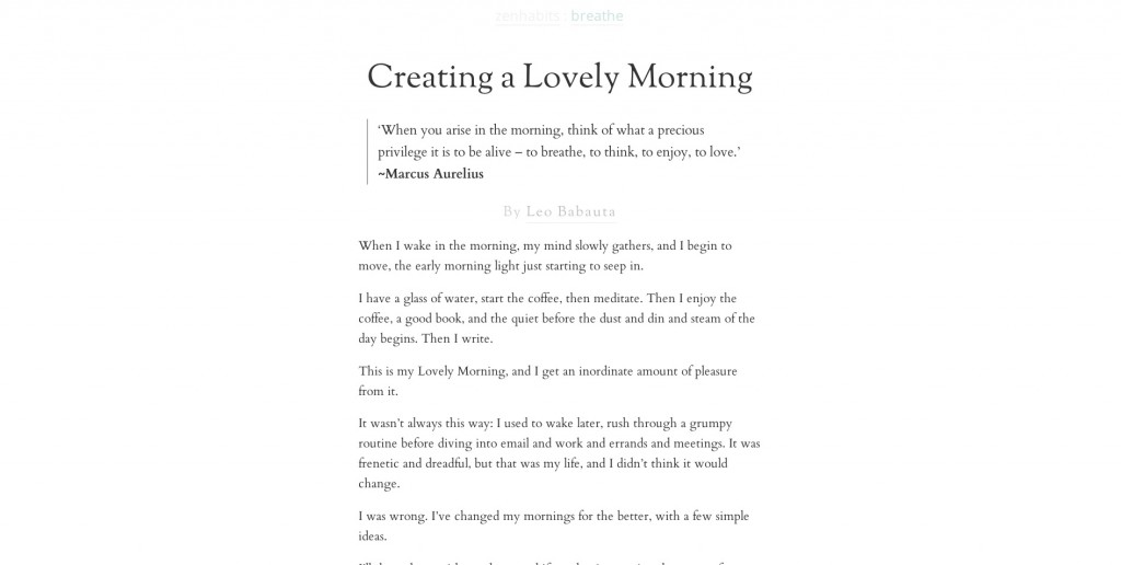
As you can tell in Leo Babuata’s design, font type, size, and spacing can make an impact on your emotions. On Zen Habits, the design is intentionally breathable and open. Nothing is cluttered. His typography supports the design but also tells the same story.
What does your font say?

(images courtesy of Wikipedia Images and FontSquirrel)
Which emotion are you hoping to elicit in your design? If you need respect from your visitors, go with fonts like New Times Roman or Garamond. If you want to them to view you as creative, try a font that pushes the envelope, like New Facebook or Base 05.
Fonts should echo your design intention. Fonts, like love interests, should never be randomly chosen based on looks. They should be able to further your emotional story.
When a user first visitors your website, they get an impression of who you are, and create a way in which to relate to you. Colors, fonts, and other visual design choices automatically set the scene–they’re like the clothes of a website.
For example, when you go to Wikipedia, you can see by the blue and gray color scheme that it’s dependable and reliable. You can surmise by the font choice and size that it’s serious and smart. And you can also tell by the images that it doesn’t pay for stock. I’m joking, sometimes Wikipedia has great images, but imagery is not the focus point of Wikipedia. The heart of Wikipedia, and all websites, is the content. I personally wouldn’t want to sit next to Wikipedia at a party. Imagine how boring that would be. But, Wikipedia would be a good friend to text. (More about that, later.)
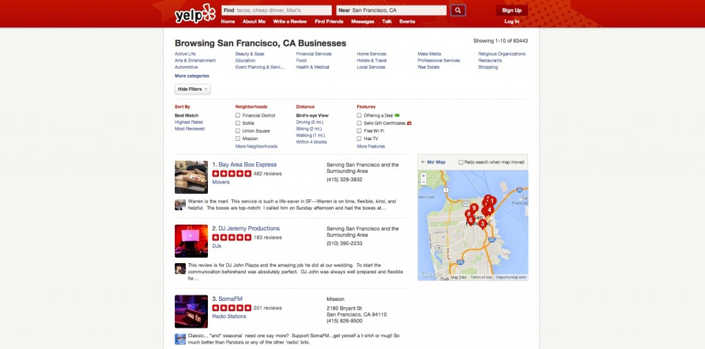
Another example is Yelp, which uses blue and red primarily. What do those colors say in combination with what we understand about Yelp? It’s seeking to be trustworthy and to grab your attention. Red definitely pulls the eye to the key feature of Yelp–the reviews. Although red can make you hungrier when you’re thinking about food, it can also grab your attention even when you’re not hungry.
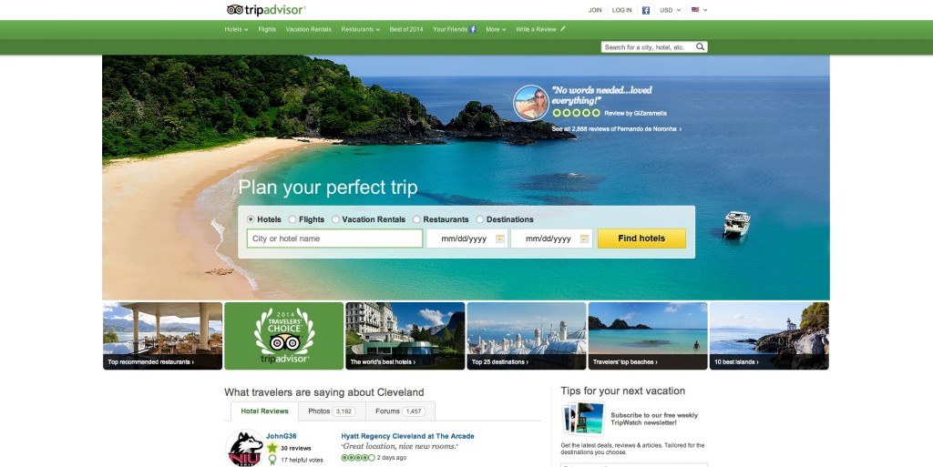
Some websites are green and blue. One example is TripAdvisor, which uses these colors to convey a sense of relaxation (you are going on vacation, after all), and trust (you’re reading actual reviews from other users).
Have you noticed the trend? Blue is often used in web design to communicate trust and dependability.
Let’s take a look at how colors engage our emotions:
Referring back to your color choices, can you see how your design is exciting those emotions?
Earlier, I said that text is not enough, but make no mistake that it’s certainly a huge part of the emotional experience. In his groundbreaking book, Designing for Emotion, Aarron Walter shares a powerful visualization. What type of person would your website be?
Understanding the personality of your website will help you decide how to interact with your visitors. As I mentioned earlier about meeting Wikipedia at a party, think about how visitors relate to you. Do they come to you for a laugh, or inspiration, or authority? Not just what you say but also how you say it impacts how others respond. You can, and must, elicit emotion through content.
Whatever the emotion you’re seeking to provoke, there’s an image that will go along with it.
Images are tethered to content. Images support content and sometimes revive interest in what you’re saying. In much the same way that we communicate with more than just our words, by using tone, facial expressions, and body language to express ourselves and elicit specific emotional responses, images do the same thing for text.
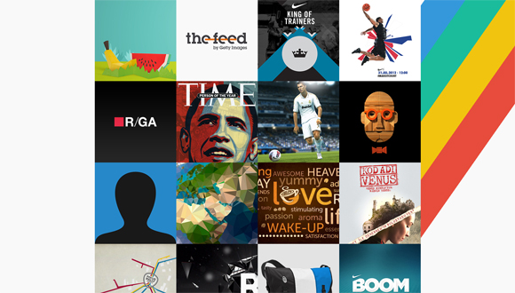
Successful design uses images to relate to the audience. Images can pull any emotion.
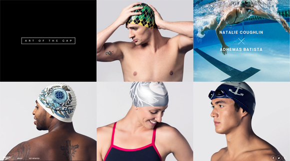
One trend that I’m particularly excited about is the use of fullscreen videos. These videos are a little slice of life, not long enough to demand full engagement, but long enough to convey a message with visitors. Consider these sites:
PayPal
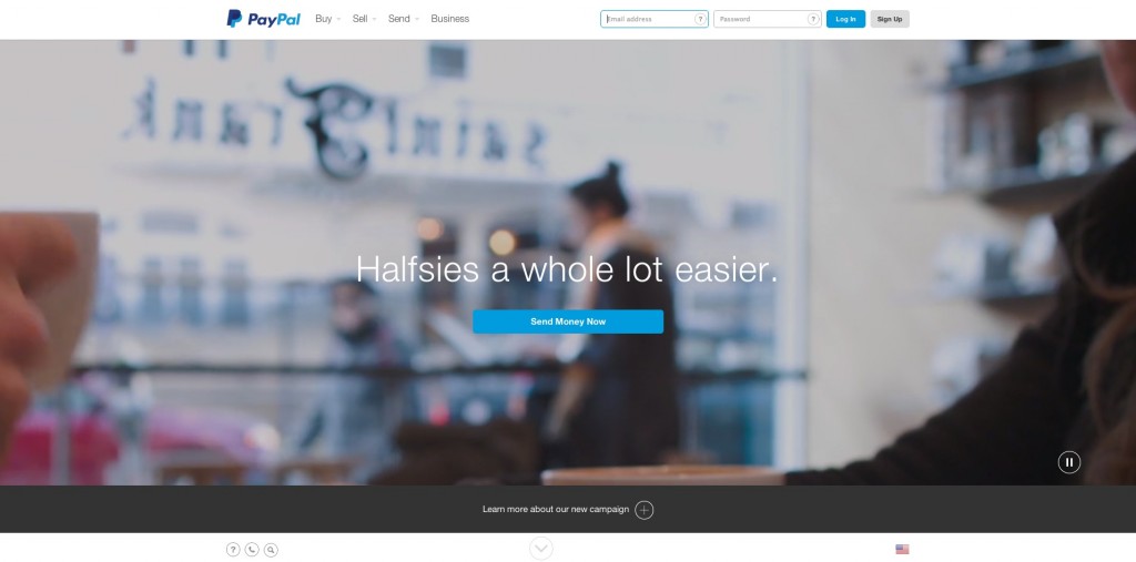
I love the use of videos (different ones load each time you visit). It softly reinforces social proof–others are using PayPal and so should you. Along with the color scheme, it elicits trust and dependability.
Vimeo
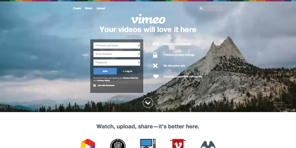
Vimeo is YouTube’s artsy step-brother. It’s certainly developed a reputation for stunning videos, and its homepage definitely carries this message. You just want to be a part of the community because of the inspirational videos on the sign up page alone.
Gifn
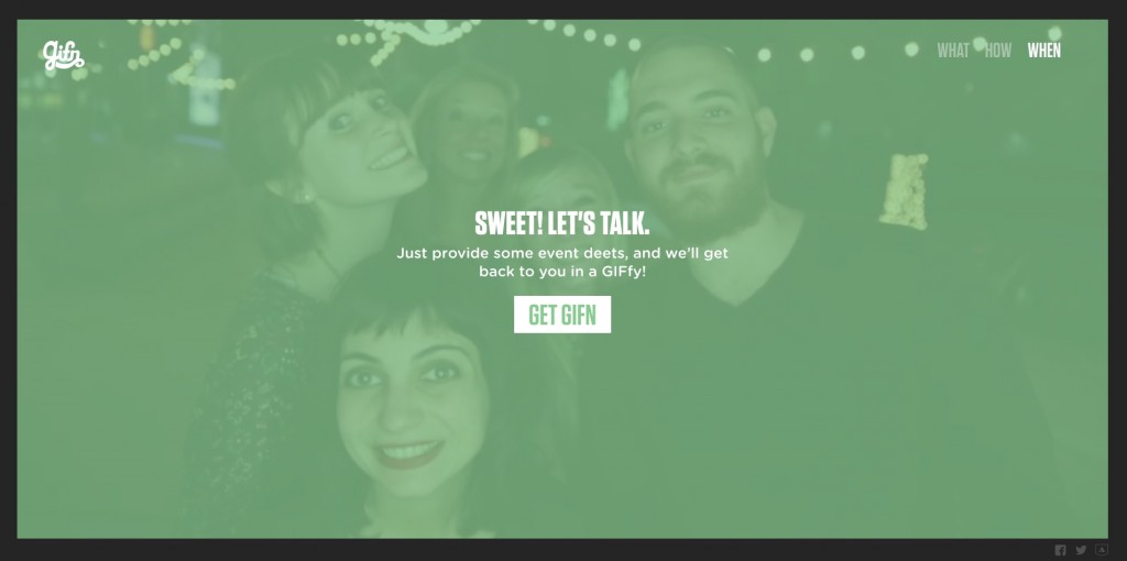
You may not have heard of Gifn, but it showcases a beautiful and energetic design that makes you want to join the fun. Take a look at the series of videos on the homepage. How does it make you feel? Happy! It’s hard not to smile, especially since everyone’s smiling at you.
On the surface, it may seem that reading an article on a website is an emotionless experience, but science tells us that we use emotions to inform our understanding. So, yes, you are experiencing an emotion right now, but what could it be? Let’s come back to that question at the end of the article, with enhanced understanding.
What is Emotion?
In his book, Your Brain: The Missing Manual, Matthew MacDonald describes emotion as the “brain’s auto-programmed response to certain stimuli.” He carefully distinguishes it from feeling. Feelings are the way we interpret emotion. Whereas, emotion is immediate, unconscious, and visceral, feeling, on the other hand, is processed and conscious.Why is Emotion Important In Design?
“I’ve learned that people will forget what you said, people will forget what you did, but people will never forget how you made them feel.”Emotion has the power to foster a lasting relationship with your visitors. If you can elicit an emotional response from a visitor, he’ll remember the experience long after everything else has faded.
-Maya Angelou
Take a look at these websites:
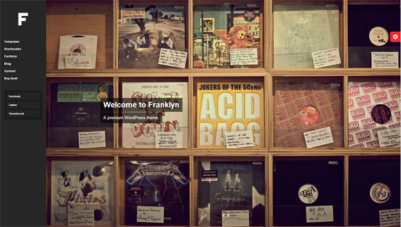
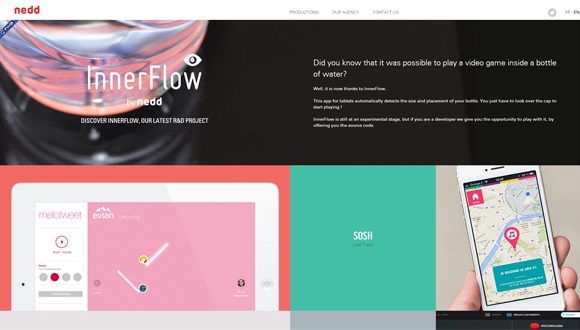
Mahe
You start out with a perfectly lovely view of Paris–but nothing we’ve haven’t all seen before. What makes you sit up and take notice is the animation effect. It’s simply beautiful and surprising. Although you may not remember everything about this site, you’ll certainly remember the feeling of surprise as you scrolled down for the first time.
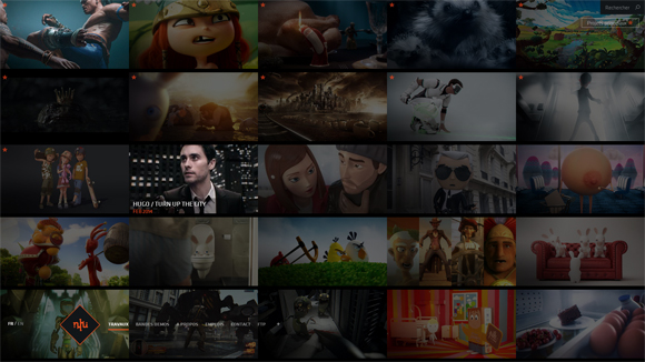
Iugo
No music, just flight. Who doesn’t love travelling through clouds without leaving your seat? This almost seamless video evokes excitement and anticipation–you’re heading somewhere, you just don’t know where. I can’t tell you how long I’ve stared at this video (it would be embarrassing). The takeaway is that this site stirred my emotions, held my attention, and left a lasting impression.
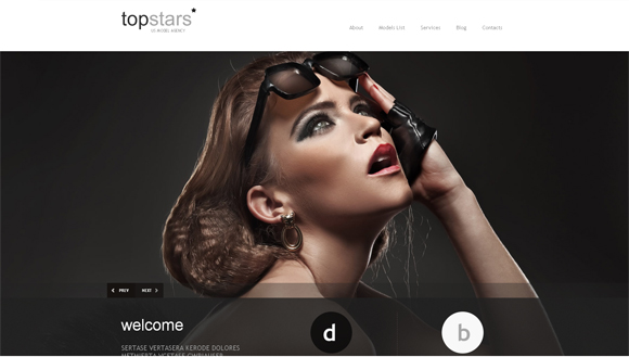
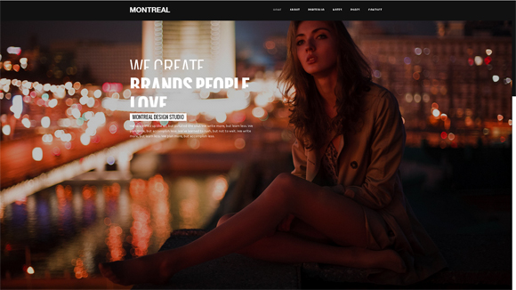
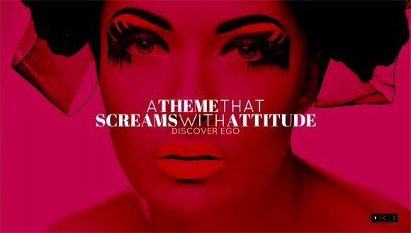
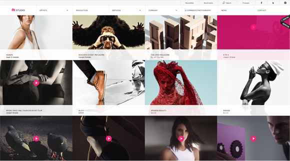
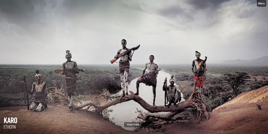
Before They
I dare you to pull up this website and not scroll through. Stunning, high-resolution images and intuitive design tell a story that appeals to your emotions.
The point of all design is to engage viewers. Engendering positive emotions can lead to longer visits, higher engagement, and more excitement about your product.
Important Components of Emotional Design
Many people rely on text to form emotional bonds with their visitors, but text alone is not enough to create emotion.Even on a site like Zen Habits, which is famously minimalist, it’s emotional appeal does not derive solely from text. As a reader, you feel at peace, or zen, on the site because it was designed in such a way as to evoke that emotion within you. There’s no sidebar. There’s no images. But, there is white space, and lots of it. It feels pure, authentic, and truthful.
As you can tell in Leo Babuata’s design, font type, size, and spacing can make an impact on your emotions. On Zen Habits, the design is intentionally breathable and open. Nothing is cluttered. His typography supports the design but also tells the same story.
What does your font say?
Fonts can be friendly, serious, smart, and unfortunate. Fonts can be separated into lots of different categories, but for the purpose of this article, we’ll discuss the four major categories: Serif (has embellishments on the ends of letters); Sans Serif (without serifs, or embellishments on the ends of letters); Script; and Decorative.
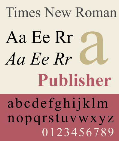
Serif fonts convey traditionalism and respect. Think Times New Roman:
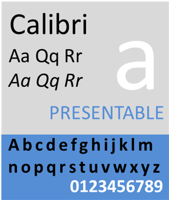
Sans serif fonts are decidedly more modern. Think Calibri:
Script is sophisticated and can be conservative. Think Pacifico:
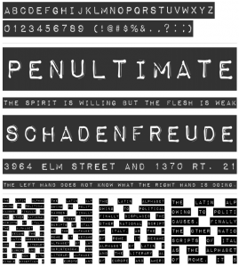
Decorative is whimsical and creative. Think Impact Label:

(images courtesy of Wikipedia Images and FontSquirrel)
Fonts should echo your design intention. Fonts, like love interests, should never be randomly chosen based on looks. They should be able to further your emotional story.
What about colors?
Color is, undoubtedly, one of the best solutions for introducing and increasing emotional response to your web design. Science has proven over and over again that humans equate colors to emotions. Why do you think that McDonald’s logo yellow and red? It elicits hunger and optimism.When a user first visitors your website, they get an impression of who you are, and create a way in which to relate to you. Colors, fonts, and other visual design choices automatically set the scene–they’re like the clothes of a website.
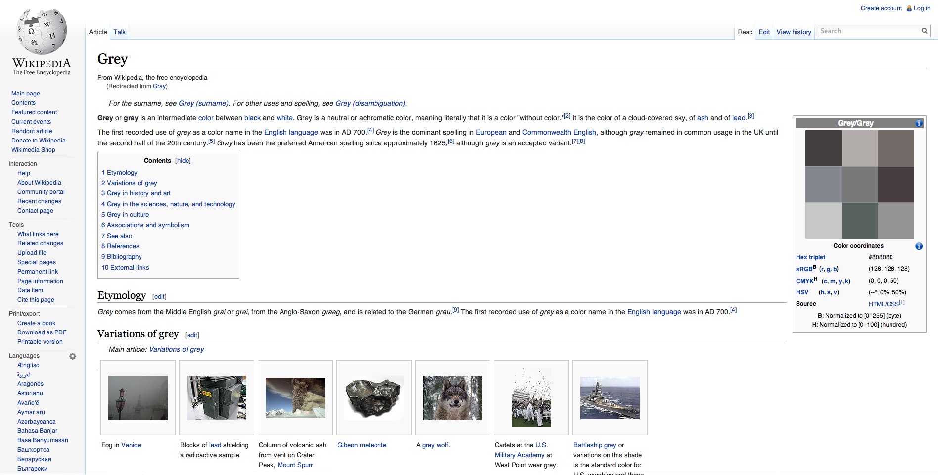
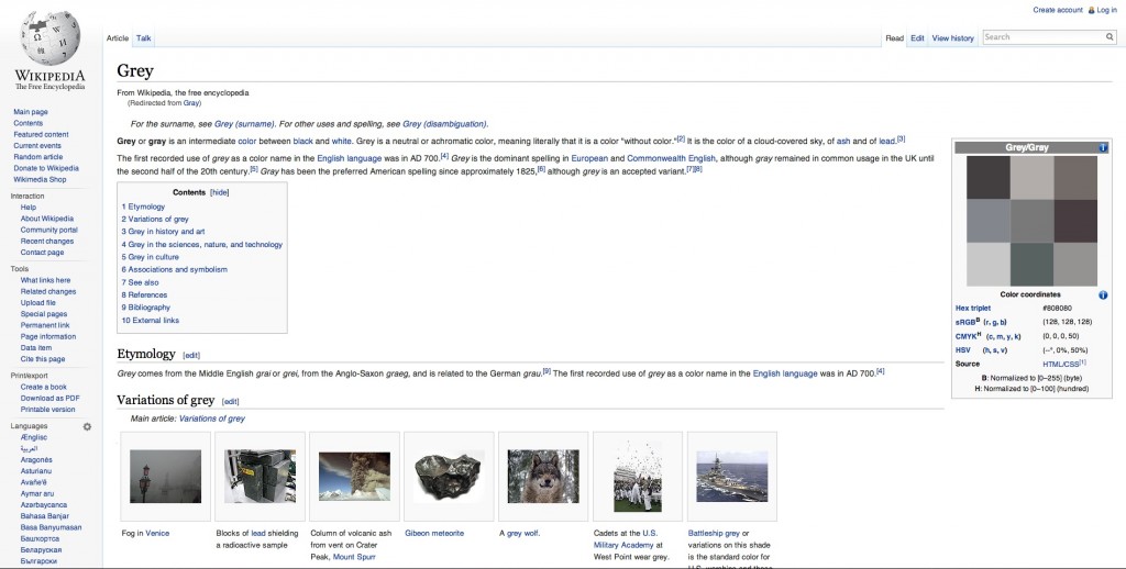
For example, when you go to Wikipedia, you can see by the blue and gray color scheme that it’s dependable and reliable. You can surmise by the font choice and size that it’s serious and smart. And you can also tell by the images that it doesn’t pay for stock. I’m joking, sometimes Wikipedia has great images, but imagery is not the focus point of Wikipedia. The heart of Wikipedia, and all websites, is the content. I personally wouldn’t want to sit next to Wikipedia at a party. Imagine how boring that would be. But, Wikipedia would be a good friend to text. (More about that, later.)
Another example is Yelp, which uses blue and red primarily. What do those colors say in combination with what we understand about Yelp? It’s seeking to be trustworthy and to grab your attention. Red definitely pulls the eye to the key feature of Yelp–the reviews. Although red can make you hungrier when you’re thinking about food, it can also grab your attention even when you’re not hungry.
Some websites are green and blue. One example is TripAdvisor, which uses these colors to convey a sense of relaxation (you are going on vacation, after all), and trust (you’re reading actual reviews from other users).
Have you noticed the trend? Blue is often used in web design to communicate trust and dependability.
Let’s take a look at how colors engage our emotions:
- Yellow: Happy, Optimistic, Clarity,
- Orange: Friendly, but love it or hate it
- Red: Exciting, Youthful, Urgent, Attention Grabbing
- Purple: Creative, Imaginative, Uplifting
- Blue: Trustworthy, Dependable, Secure
- Green: Peaceful, Growth, Relaxing
- Gray: Balance, Neutral, Reliable, Intelligent
- Black: Luxurious, Powerful, Authoritative
Referring back to your color choices, can you see how your design is exciting those emotions?
What about content?
“If your website were a person, who would it be? Is it serious, buttoned-up, all business, yet trustworthy, and capable? Is it a wisecracking buddy that makes even mundane tasks fun?”
-Aarron Walter, Designing for Emotion
Earlier, I said that text is not enough, but make no mistake that it’s certainly a huge part of the emotional experience. In his groundbreaking book, Designing for Emotion, Aarron Walter shares a powerful visualization. What type of person would your website be?
Understanding the personality of your website will help you decide how to interact with your visitors. As I mentioned earlier about meeting Wikipedia at a party, think about how visitors relate to you. Do they come to you for a laugh, or inspiration, or authority? Not just what you say but also how you say it impacts how others respond. You can, and must, elicit emotion through content.
What about images?
When it comes to evoking emotion, what better tool than an image? A picture is worth a thousand words, indeed. Think of images that deeply move you. It doesn’t have to be a serious tear-jerker. It could be something so silly it had you laughing for days.Whatever the emotion you’re seeking to provoke, there’s an image that will go along with it.
Images are tethered to content. Images support content and sometimes revive interest in what you’re saying. In much the same way that we communicate with more than just our words, by using tone, facial expressions, and body language to express ourselves and elicit specific emotional responses, images do the same thing for text.
Successful design uses images to relate to the audience. Images can pull any emotion.
One trend that I’m particularly excited about is the use of fullscreen videos. These videos are a little slice of life, not long enough to demand full engagement, but long enough to convey a message with visitors. Consider these sites:
PayPal
I love the use of videos (different ones load each time you visit). It softly reinforces social proof–others are using PayPal and so should you. Along with the color scheme, it elicits trust and dependability.
Vimeo
Vimeo is YouTube’s artsy step-brother. It’s certainly developed a reputation for stunning videos, and its homepage definitely carries this message. You just want to be a part of the community because of the inspirational videos on the sign up page alone.
Gifn
You may not have heard of Gifn, but it showcases a beautiful and energetic design that makes you want to join the fun. Take a look at the series of videos on the homepage. How does it make you feel? Happy! It’s hard not to smile, especially since everyone’s smiling at you.